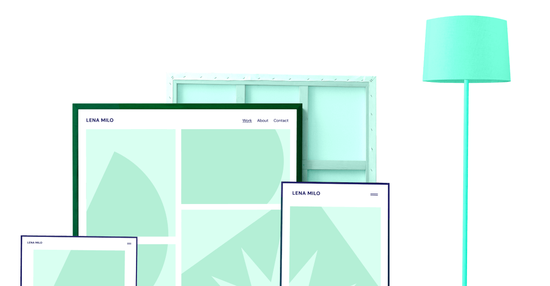
Design for up to 7 devices to ensure your website is perfect on any screen.
Optimized Performance
Add breakpoints without risking your website’s performance.
Zero Coding Required
Customize each breakpoint without adding a single line of code.
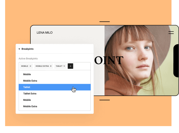
Customize Your Breakpoints
Design for any screen size and create pixel-perfect websites on any device, zero coding required.
Design Without Limits
Use breakpoints to get the perfect design on any device. Add up to 7 devices, with the ability to fit your designs to every screen.
ADDITIONAL BREAKPOINTS
Control Your Creative Vision
Control each breakpoint value individually and customize them to fit your needs. Enjoy complete design flexibility without writing a single line of code.
custom breakpoints
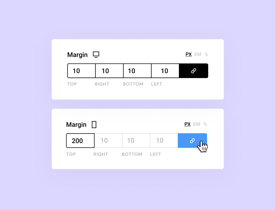
View Your Breakpoint Values
See how values transition from one device to another. View the starting values and change breakpoints accordingly to keep your designs consistent on each screen.
visible responsive values
Optimize Your Designs With Breakpoints
Enjoy even more design freedom with breakpoints, and optimize your creations for any device.
Experience Full Design Control
Breakpoints help take your designs to the next level, no matter where they’re being seen. Make the most of Elementor’s advanced design features while ensuring your work is pixel-perfect on every device.
Navigation Menu
Control how your menu is displayed on every device so that it’s always easy to navigate.
Motion Effect
Adjust the movement for each element to ensure they remain in sync on every device.
Absolute Positioning
Set the right position for evey componnent on each size you pick.
Master Breakpoints With Elementor
Learn about responsive design and breakpoints through video tutorials, courses, blogs, and more.