With the container element you can now harness the power of flexbox CSS. The primary goal behind flex is to provide the ability to alter each items’ width, height, and order, to best fill the available space of the container. This feature will replace the current section, column, and inner section functionality of the Elementor editor.

Important! Use with caution. Please do not use Developer Edition on production sites. Developer Edition releases, just like beta releases, may not be stable. Use it on staging environments only, and back up your entire website before updating.
Backwards Compatibility
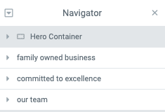
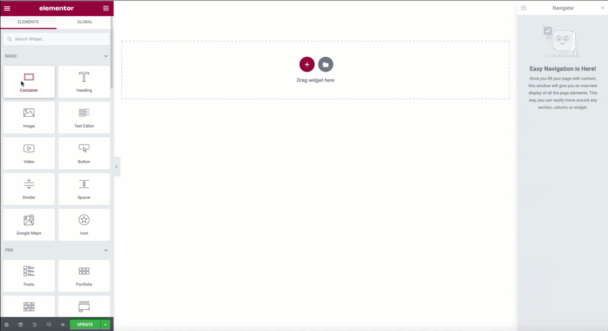
If you have an existing Elementor website, or wish to use older templates from the library that use sections, do not worry. Pre-existing sections, columns, and inner sections will still continue to function as always and may be edited. In the navigator you will see that containers are marked with an icon. This allows you to make the transition to containers at your own pace.
Tip: While it is not possible to create a new section (only containers), you may duplicate an existing section or save to your template library and import/edit as needed if your design requires it.
Why Should Container Elements Be Used
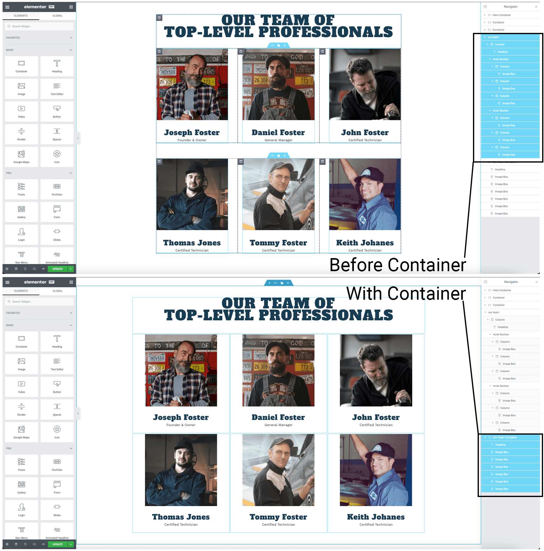
Container elements provide more optimized solutions for nestable elements. You may add multiple widgets to the same container and align them relatively without the need for additional columns or inner sections thus improving the performance of your page.
See Example
How To Add Container Elements
The Container element is currently an experiment. To enable containers, navigate to Dashboard > Elementor > Settings > Experiments.
Adding With The New Container Option
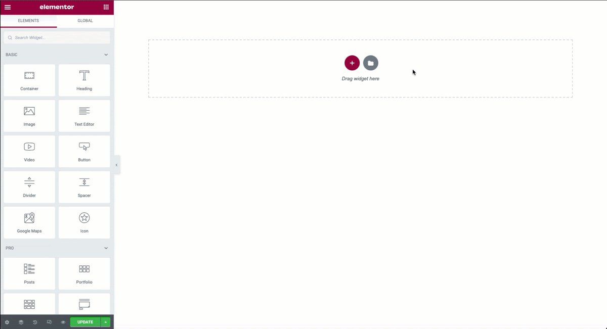
- From the main editor window, click the + sign to create a new container.
- Select a preset Flex Layout that best suits your design
- Add add your content to the new layout
Tip: Additional containers may be added using the Container Widget or duplicating from the navigator.
Adding With The Container Widget
- From the editor panel drag a Container widget onto your page or into any existing container.
- Choose the Row or Column options from the direction.
- Easily add additional Container Widgets or duplicate from the navigator panel.
Editing The Container Properties
Layout Controls

Container
- Width – Use the slider or manually enter a value to set the desired container width in PX, %, or VW
- Min Height – Use the slider or manually enter a value to set the desired container width in PX or VH
- Direction – From the dropdown selector choose Default, Row, Column, Revered Row or Reversed Column
- Align Items – Choose your alignment from the icons Flex Start, Center, Flex End, or Stretch
- Justify Content – Choose the justification from the icons Flex Start, Center, Flex End, Space Between, Space Around, Space Evenly
- Spacing – Use the slider or manually enter values to increase or decrease the space between elements in the flex gap property
- Wrap – From the icons chose No Wrap, or Wrap this will define whether the items are forced in a single line (No Wrap) or can be flowed into multiple lines (Wrap)
- Align Content – (If wrap is enabled) Select the alignment preference from the dropdown menu between default, center, flex start, flex end, space between, space around, or space evenly.
Additional Controls
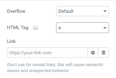
- Overflow – From the dropdown selector, choose Default or Hidden
- HTML Tag – From the dropdown menu select the most appropriate HTML tag for you container from the options
Making A Container Clickable With An “A” Tag
You may make any container clickable by first selecting the “a” option from the HTML tag above. A link option will then appear below. Enter the URL or use the dynamic options by clicking the stack icon.
Container Styles
The Container can be customized by using Style Tab
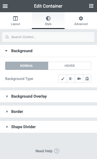
Style Options
The following can be set for both normal and hover states.
Background
- Background Type – Select the background type, color, gradient, image, or slideshow
- Color (background): From the color picker, select the color(s) for the field
- Image: Click to select or upload an image or images if slideshow type is used to the media library to use as the background image of your container
Background Overlay
- Background Type – Select the background type, color, gradient, image
- Color (background): From the color picker, select the color(s) for the field
- Image: Click to select or upload an image to the media library to use as the background overlay image of your container
- Opacity: Use the slider or manually enter a value in the field
Border
- Border type: From the dropdown menu select between solid, double, dotted, dashed, or grooved
- Width (border): Enter a chosen value in the fields based on px, em, or %
- Color (border): From the color picker, choose the background color for your border
- Border Radius: Enter a chosen value in the fields based on px, em, or %
- Box Shadow: Click the pencil icon to open the shadow properties options.
Shape Divider
- Choose to display at the Top or Bottom of your container
- Type: Click the dropdown to choose your Shape Divider style
- Color: Pick a color
- Width: Set the width of your Shape Divider
- Height: Set the height of your Shape Divider
- Flip: Flip the direction of your Shape Divider
- Bring to front: Force your Shape Divider to be in front of other objects

Advanced Tab Controls
In the Advanced Tab you may manually set the container width and other properties. These parallel settings will override the parent container settings.
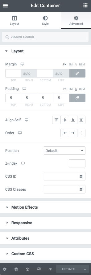
Layout
The following advanced settings may be applied to the container
- Align Self – Select the icon best suited to your needs. Options are flex start, center, flex end, and stretch
- Order – Select from the icons to choose start, end, or custom
Adding Elements To The Container
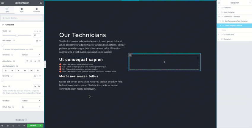
When adding Widgets to your Containers, it will use the Direction option. Choose between Row, Column, or the Reversed options depending on your needs and layout. Use the Gap option to add space between the elements. Use the align and justify properties for even more control of your design.
Each widget’s width can be set in the Advanced tab. In the example above all elements are now occupying one container using the Wrap option rather than using columns or inner sections thus reducing the amount of dividers and improving the performance of your page.
Widget Advanced Tab Flex Settings
When containers are enabled, each widget will have additional flex options in the Advanced tab that have been optimized.
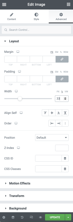
Layout
- Margin: Enter a value in the field based on PX, EM, %, or REM
- Padding: Enter a value in the field based on PX, EM, %, or REM
- Width: Use the slider or manually enter a value to set the width of the widget based in PX, %, or VW
- Align Self – Select the icon best suited to your needs. Options are flex start, center, flex end, and stretch
- Order – Select from the icons to choose start, end, or custom
- Position: Use the dropdown menu to select from default, absolute, or fixed. If either Absolute or Fixed are selected, the following options also become available.
- Horizontal Orientation: Sets the horizontal reference point for the absolute positioning, with choices of either Start or End.
- Offset: Changes the horizontal reference point by the amount of the offset
- Vertical Orientation: Sets the vertical reference point for the absolute positioning, with choices of either Start or End.
- Offset: Changes the vertical reference point by the amount of the offset
- Z-index: Set the Z-Index. Learn more about Z-Index
- CSS ID: Set a CSS ID for your section
- CSS Classes: Set CSS Classes for your section