Personalize the account page of WooCommerce with the My Account widget. Change the layout, tab names, tab alignment, as well as colors, and fonts. When publishing, you will be prompted to automatically assign this as your default My Account page in the WooCommerce settings.
Content
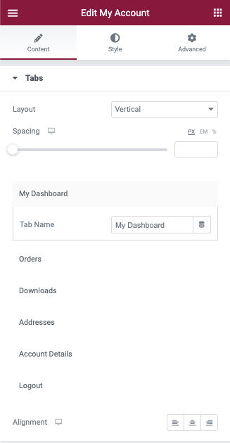
Tabs
- Layout: From the dropdown menu select between vertical or horizontal
- Spacing: Use the slider or manually enter a value in PX, EM, or %
- Tab Names: Click each tab name to edit the value
- Alignment: Use the icon to select between left, center, or right alignment
Style
Tabs
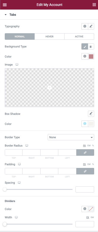
- Typography: From the pencil icon, click to open the font option panel to choose the family, weight, transform, style, decoration, line height, and letter spacing options
- Background Type: Use the icons to choose between a solid or gradient background for the normal, hover, and active states
- Color (background): From the color picker, select the color(s) of the tab for the normal, hover, and active states
- Image: Click to select or upload an image to the media library to use as the background image of your tab for the normal, hover, and active states
- Box Shadow: Click the pencil icon to open the shadow properties options
- Color (Text): From the color picker, choose the color for your field text.
Borders
- Border type: From the dropdown menu select between solid, double, dotted, dashed, or grooved
- Width (border): Enter a chosen value in the fields based on px, em, or %
- Color (border): From the color picker, choose the background color for your border
- Border Radius: Enter a chosen value in the fields based on px, em, or %
- Padding: Enter a chosen value in the fields based on px, em, or %
Dividers
- Color: From the color picker, choose the color for your Divider
- Weight: Use the slider or manual enter a value in the field (PX, EM)
Sections
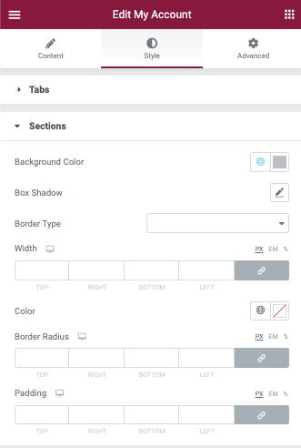
- Background Color: From the color picker, select the color for your sections
- Box Shadow: Click the pencil icon to open the shadow properties options
Borders
- Border type: From the dropdown menu select between solid, double, dotted, dashed, or grooved
- Width (border): Enter a chosen value in the fields based on px, em, or %
- Color (border): From the color picker, choose the background color for your border
- Border Radius: Enter a chosen value in the fields based on px, em, or %
- Padding: Enter a chosen value in the fields based on px, em, or %
Typography
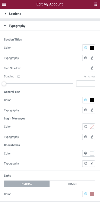
Section Titles
- Color: From the color picker, choose the color for your titles. This color will apply to all section titles.
- Typography: From the pencil icon, click to open the font option panel to choose the family, weight, transform, style, decoration, line height, and letter spacing options
- Text Shadow (Titles Only): Click the pencil icon to open the shadow properties options.
- Spacing: Use the slider to increase or decrease the spacing between components.
General Text
- Color: From the color picker, choose the color for your text. This color will apply to all text.
- Typography: From the pencil icon, click to open the font option panel to choose the family, weight, transform, style, decoration, line height, and letter spacing options
Login Messages
- Color: From the color picker, choose the color for your messages
- Typography: From the pencil icon, click to open the font option panel to choose the family, weight, transform, style, decoration, line height, and letter spacing options
Checkboxes
- Color: From the color picker, choose the color for your messages
- Typography: From the pencil icon, click to open the font option panel to choose the family, weight, transform, style, decoration, line height, and letter spacing options
Links
The following options are available for normal and hover states.
- Color: From the color picker, choose the color for your links
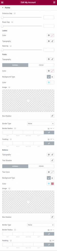
Forms
Layout
- Column Gap: Use the slider or enter the value in the field in PX
- Rows Gap: Use the slider or enter the value in the field in PX
Labels
- Color: From the color picker, choose the color for your labels. This color will apply to all labels.
- Typography: From the pencil icon, click to open the font option panel to choose the family, weight, transform, style, decoration, line height, and letter spacing options
- Spacing: Use the slider to increase or decrease the spacing between components.
Fields
- Typography: From the pencil icon, click to open the font option panel to choose the family, weight, transform, style, decoration, line height, and letter spacing options
- Color (Text): From the color picker, choose the color for your field text. This color will apply to all field text.
- Background Type: Use the icons to choose between a solid or gradient background
- Color (background): From the color picker, select the color(s) for the field
- Image: Click to select or upload an image to the media library to use as the background image of your field
- Box Shadow: Click the pencil icon to open the shadow properties options.
Borders (Fields)
- Border type: From the dropdown menu select between solid, double, dotted, dashed, or grooved
- Width (border): Enter a chosen value in the fields based on px, em, or %
- Color (border): From the color picker, choose the background color for your border
- Border Radius: Enter a chosen value in the fields based on px, em, or %
- Padding: Enter a chosen value in the fields based on px, em, or %
Button
- Typography: From the pencil icon, click to open the font option panel to choose the family, weight, transform, style, decoration, line height, and letter spacing options
- Color (Text): From the color picker, choose the color for your field text. This color will apply to all field text. You may apply a custom color to a sections field text in the Customize options shown below
- Background Type: Use the icons to choose between a solid or gradient background
- Color (background): From the color picker, select the color(s) for the field
- Image: Click to select or upload an image to the media library to use as the background image of your field
- Box Shadow: Click the pencil icon to open the shadow properties options.
Borders (Button)
- Border type: From the dropdown menu select between solid, double, dotted, dashed, or grooved
- Width (border): Enter a chosen value in the fields based on px, em, or %
- Color (border): From the color picker, choose the background color for your border
- Border Radius: Enter a chosen value in the fields based on px, em, or %
- Padding: Enter a chosen value in the fields based on px, em, or %
Order Details
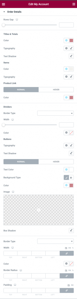
Layout
- Rows Gap: Use the slider or enter the value in the field in PX
Titles and Totals
- Color: From the color picker, choose the text color for your titles and totals.
- Typography: From the pencil icon, click to open the font option panel to choose the family, weight, transform, style, decoration, line height, and letter spacing options
- Text Shadow: Click the pencil icon to open the shadow properties options.
Items
- Color: From the color picker, choose the text color for your items
- Typography: From the pencil icon, click to open the font option panel to choose the family, weight, transform, style, decoration, line height, and letter spacing options
Product Link
The following options are available for normal and hover states.
- Color: From the color picker, choose the color for your product links
Dividers
- Border Type: From the dropdown menu select between solid, double, dotted, dashed, or grooved
- Color: From the color picker, choose the color for your Dividers
- Weight: Use the slider or manual enter a value in the field (PX, EM)
Buttons
- Typography: From the pencil icon, click to open the font option panel to choose the family, weight, transform, style, decoration, line height, and letter spacing options
- Color (Text): From the color picker, choose the color for your field text. This color will apply to all field text. You may apply a custom color to a sections field text in the Customize options shown below
- Background Type: Use the icons to choose between a solid or gradient background
- Color (background): From the color picker, select the color(s) for the field
- Image: Click to select or upload an image to the media library to use as the background image of your field
- Box Shadow: Click the pencil icon to open the shadow properties options.
Borders (Button)
- Border type: From the dropdown menu select between solid, double, dotted, dashed, or grooved
- Width (border): Enter a chosen value in the fields based on px, em, or %
- Color (border): From the color picker, choose the background color for your border
- Border Radius: Enter a chosen value in the fields based on px, em, or %
- Padding: Enter a chosen value in the fields based on px, em, or %
Advanced
Global Advanced tab options are available for this widget.