It’s been two years since we started the tradition of Elementor’s monthly showcase. Since the beginning, one of the goals of our monthly showcase has been to illustrate the advanced capabilities of Elementor through 10 websites built by our users. This highlights the ways in which both non-professional designers and novice Elementor users alike can achieve impressive results. These ten sites are here to inspire you when you set out to design and build your next website.
When we select these sites, our discussions emphasize their design more than other aspects (content, user experience, etc.). In this setting, site performance is not considered one of our top focal points. First and foremost, these sites are meant to inspire your creativity and to drive you to build better-looking sites. If you get inspired by a website but feel it is too slow, try to recreate it in a way that involves the same effects, yet perform faster.
This month, we have a particularly diverse list of websites, which includes a renowned Swedish manufacturer of high-end home speakers, an unconventional Italian travel agency, a tech-savvy French film production company, and a talented designer from Colombia.
Browse through these beauties, and if you have sites of your own, click the button at the bottom of the article to submit them.
Let’s begin.
Daniel Muñoz Tattoo
Daniel Muñoz is a visual designer from Medellín, Colombia who specializes in user interface design. He has more than 10 years of experience with teams dedicated to the development of UI & UX solutions for both small and big companies. Nowadays, Daniel works as a freelance designer and dedicates much of his time to his other profession, tattoo art.
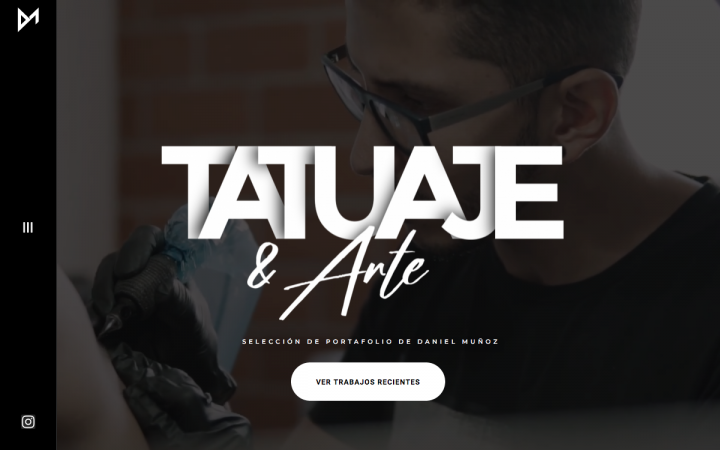
Daniel’s website gathered several design elements to create artistic combinations that express what his service and professional approach is all about: combining classic art with a modern vibe. Munoz’s video background of choice is a slow-motion, first-hand observation of him hard at work in his studio. This allows for an authentic understanding of the focus, dedication and investment he uses throughout his work.
For his hero text, the large, capital letters with pronounced shadow effects inform the user that Munoz is a modern, cutting-edge artist who uses his talent to create unique, unusual artwork. In parallel, the second half of the hero text is in a handwritten style text, which combines an artistic style of modernity combined with a personable, old-fashioned touch.
Munoz’s site is actually just one page, and although the artwork in his justified grid gallery varies between black and white tattoos, followed by black and white drawings and colored paintings, the black background is able to accentuate the details of each intricate illustration-type, as well as emphasize the clarity of the white text elements.
Munoz succeeded in presenting his artistic style in a clear, personable way. His transparent self-representation gives his website visitors a precise understanding of the type of artwork and style and his parlor specializes in. This can only make the goal of a happy client easier to achieve.
Design & Development: Daniel Muñoz
Theme: Hello
Plugins: Google Analytics Dashboard for WP, Sticky Menu (or Anything!) on Scroll, Tiny Portfolio Widgets For Elementor
Forest to Home
Founded in 2015 by William Hibbert and Samuel Baker of the luscious Wiltshire countryside in the UK, Forest to Home handcrafts sustainable and solid timber furniture, with each piece capturing the spirit of the natural world that surrounds them.
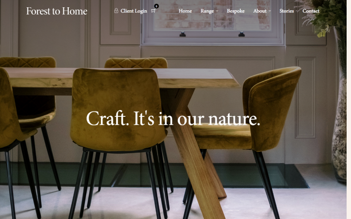
Forest To Home’s website focuses on the brand’s exact business model: designing and creating furniture and decorative pieces that bring the natural creations of the forest right into the client’s home. The choice of one single classic serif font used throughout the entire site indicates a sense of the simplicity and originality that wood represents. This, of course, is represented by the theme at large: the vast presence of wood in the forest.
The typeface also complements the warm, earthy and natural color scheme. These shades of brown, coupled with black and white minimalism are yet another expression of the Forest to Home brand. This is especially prevalent in the Meet the team page, introduced by a full-width, detailed cover image of a carpenter perfecting the finishing touches of a newly created table. The combination of old-fashioned black and white photography coupled with modern color portraits represents the essence of their craftsmanship: modern artists creating classical, old-fashioned works of art and creativity.
Finally, what we see throughout the entire website is a visual hierarchy of sheer clarity. Thanks to the symmetrical and square text-image composition, the neat header and footer structure, and the consistently-themed wood-centric images distributed evenly throughout, the user navigation is straightforward, intuitive and natural for the visitor.
Design & Development: Ross Merritt, Content Coms
Theme: Architecturer
Plugins: WooCommerce, Yoast SEO, ZM Ajax Login & Register, Advanced Flat Rate Shipping For WooCommerce, Contact Form 7, Flamingo,
Honeypot for Contact Form 7, Duplicate Post, Disable Comments, Redirection
Komini
Komini is a Gothenburg, Sweden-based creative agency of two, Erik Stenman and Arvid Lindstedt, who are passionate about web, video and branding. Considering themselves a flexible and youthful agency, they aspire to stand out from the crowd.
Komini’s previous website was built with another website builder, but after experimenting with Elementor’s motion effects capabilities, they decided to use Elementor for their new website, which would be more playful and one of a kind.
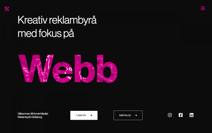
Komini chose a hero text effect like none we’ve ever seen before. The technique of a transparent hero text of rotating words, each one styled with a video fill, represents the different marketing messages chosen by the brand and fills their website with brand character and individuality.
You may not realize it at first, but the hover effects on each button in the hero section also illustrate what the brand is all about. Within the black and white backdrop, hovering over these simple buttons makes them fill up with hot pink, representing the hints of bright-colored flavor that they use in their artistic creations.
This is especially true because of this sleek, engaging color scheme of black, white and pink, conveying an artistic, fashion-themed and trendy vibe. Further down, the crisp portraits on a large, neutral background accentuate the photographs as well as the minimalist, lightweight text.
The artistic theme carries over to the next section on the homepage, with the thin headings and body text. The white background with thin column lines running down the page represent an artboard with a columns layout view — just like you’ll see in a modern vector graphic tool used by designers.
Design & Development: Arvid Lindstedt and Erik Stenman (Komini)
Theme: GeneratePress
Plugins: Smart Slider 3, LoftLoader,
Factory Market
Factory Market is one of the most important events in Italy, dedicated to handmade artists and independent producers; a craft fair where more than 100 artists, producers and designers, from all over Italy, meet to show, promote and sell their products. From May 2020, through their new website , it has also become a platform for sharing information about the handmade world in Italy, with articles, interviews, tips and a new online shop coming soon, which will include a curation of handcrafted, ethically manufactured eco-responsible quality goods, with the aim of giving visibility and support to small producers and of promoting a sustainable form of consumption.
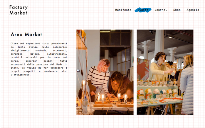
Factory Market chose a unique, creative style that takes us back to the days of typewriters and grid paper notebooks. The graph paper themed background conveys a presence of manual writing, direct person-to-product interaction, and a scribble hover effect that appears behind the menu items on hover.
Yet, the combination of the typewriter-looking font with the popular Futura sans-serif font represents Factory Market as a modern and sleek brand, using imagery reminiscent of the past to illustrate their unusual creativity.
Unusual for your standard web design elements, there is no header menu on the page. Instead, it’s located in the footer’s position. This rare method of structuring a website’s layout communicates the brand’s uniqueness and atypical design style to every visitor.
The color scheme is also an interesting choice in the good sense, as Factory Market chose a color palette that is both complementary and analogous to the reddish-orange. This red is complementary to the blue, while analogous to the beige. Just like the choice of background, typeface, hover effects, location of the navigation menu, etc., the color scheme suggests a fusion between traditional and uniqueness.
Design: Beatrice Valoti
Development: Andrea Fogliata
Theme: GeneratePress
Plugins: Akismet Anti-Spam, Cookie Notice, Duplica pagina,
Google Analytics for WordPress by MonsterInsights, GP Premium, HubSpot All-In-One Marketing – Forms, Popups, Live Chat, Sticky Header Effects for Elementor, Thumbnail Fixer for Social Media,Yoast SEO
GOODMAN et Compagnie
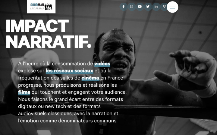
Goodman et Compagnie is a French film production company specializing in 3D, virtual reality, special motions, augmented and mixed reality, and more. The company is located in South Brittany, France, with its own 300sqm studio that provides services for companies and agencies of all fields of media — TV, cinema, internet, and offline.
Goodman et Compagnie chose a background video slideshow that centers on dramatic human expression, creating a personal connection between the website’s imagery and its visitors. The costumes, fire, acrobats, mountain landscape, amusement parks, graffiti, and so on, show us that the films produced by Goodman et Compagnie are full of excitement and thrilling effects.
The imagery maintains a theme of dramatics as you scroll down, with the emotive human expression, followed by the special effects added to the simple, sans-serif headings. The scrolling effects and the shadow effects added to these letters maintain the website’s style of classy, bold visuals.
The navbar’s hamburger menu expands into a full-screen popup, different to the more standard menus we usually see, such as dropdown or slide-out navigation. Another effect of the navbar is that because the header is sticky, it keeps the visitor focused throughout the varied video clips and dramatic photography and imagery as you scroll down.
All in all, Goodman et Compagnie strikes a fine balance in their website design: dramatic art and visuals that the human eye can embrace and dive into, without losing sight of what it hopes to learn about the film production company and of the action items we encounter while navigating their website.
Design & Development: Guillaume Verdon – agence logo
Theme: Hello
Plugins: Advanced Access Manager, Advanced Custom Fields PRO, Custom Post Type UI, Dynamic Content for Elementor, iThemes Security, JetTricks, ShortPixel Image Optimizer, The Plus Addons for Elementor Page Builder, WP Rocket, Yoast SEO
LuLeKa Experience
Lùleka Experience is an unconventional travel agency based in Rome, Italy.
The mission of this startup is pretty brave, as it offers surprise trips in Italy, customized according to the interests, time and budget of the user. The goal is no longer the destination itself, but rather to experience an intimate, true and transformative experience.
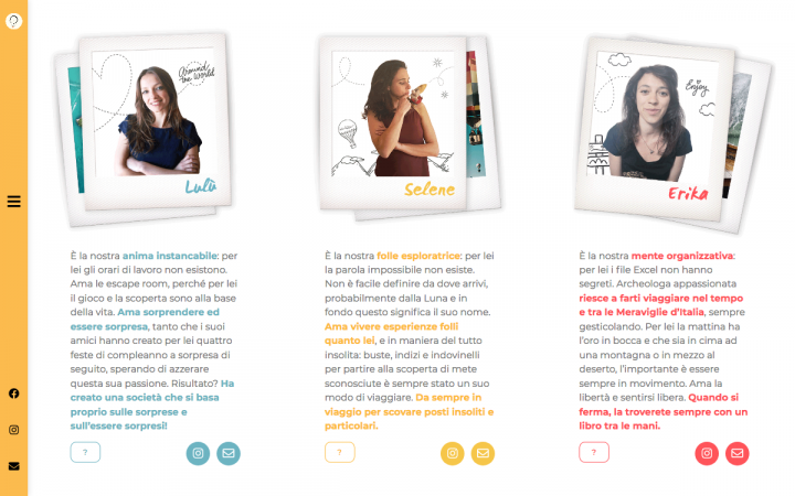
Upon entering LuLeKa’s homepage, their value proposition of “unconventional travel agency” is as visible in the entire website design as it is in the verbal description of the hero text. The visitors’ attention is immediately sparked by the friendly, child-like animation, and by the scrolling effects over the polaroid pictures along the margins. The fun, vibrant color scheme of light shades of red, blue, and yellow, in other words, the three primary colors, creates an atmosphere of optimism and spontaneity.
Once you continue to the Who We Are page, you’ll notice that each of the three business owners is represented by one of the three primary colors: Lulu is blue, Selene is yellow, and Erika is red. This creates a sense of distinction between the three columns that introduce the gals, while still achieving a consistent, uniform design between the column texts and photographs.
The usage of primary colors suggests that this agency covers the entire spectrum of components that your travel needs include — both on a foundational level and a detailed level. On a visual level, each primary color used to personify the business owners gives them each a sense of individuality, color, and uniqueness. This theme of colorful boldness is solidified by the yellow sidebar navigation menu, as it runs down the entire webpage, capturing all of the website content within a sunny, upbeat frame of mind.
Design & Development: Vittoria Mannu
Theme: Hello
Plugins: Advanced Custom Fields, Cloudflare, Extras for Elementor, Hummingbird, Leverage Browser Caching, ShortPixel Image Optimizer, Simple Custom CSS and JS, Smart Slider 3 Pro, Sticky Menu (or Anything!) on Scroll, Sucuri Security – Auditing Malware Scanner and Hardening, WhatsApp Chat, Yoast SEO
Bersus Design
Den Sabrov from Russia is engaged in the international trade and logistics sector, but his true passion is UI/UX design, always happy to help enthusiasts with their startups and promising projects. Den believes that the orthodox development process is unreasonably inflated and over-complicated, and he always tries to achieve goals with the minimal efforts, which is one of the reasons why he uses Elementor Pro. Den designs user interfaces and experiences for mobile application and web sites.
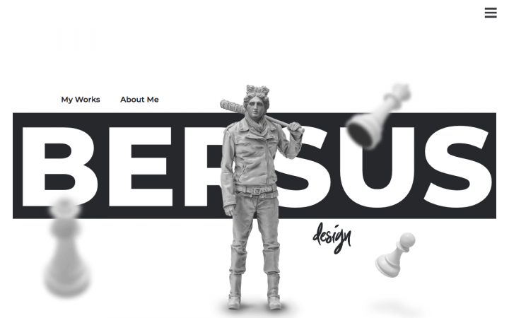
Den masters the art of motion effects when welcoming the visitor to his website through the hero content, which also displays an intriguing character that has the body of Negan from the post-apocalyptic TV show “The Walking Dead”, and the head from Michelangelo’s timeless statue of David. The blurry, rotating chess pieces in front of the growing, and shrinking large heading are what we call classic Elementor motion effects. As you scroll down, the SVG animations indicate another level of Den Sabrov’s animation mastership, followed by his apt choice of flipboxes further down.
The atypical, minimalist design scheme of black and white, along with abundant negative space between elements, complement the few colorful images that he uses sporadically as you scroll down (CTA in its hover state, and the flipboxes in their flipped state.)
With that, the About Me page on Den’s site is one of a kind, especially the “My Strongest Skills” section. This is true both in terms of information architecture and of user engagement. Hovering over each icon generates an exciting, hot pink color fill, as does the corresponding paragraph that the icon represents. Den’s creative choice of hover effects and user interaction attests to the exact messaging he is attempting to convey: he is a highly-skilled professional.
Design & Development: Den Sabrov
Theme: Hello
Plugins: Element Pack, Disable Responsive Images, Elementor Extras, Happy Elementor Addons, LoftLoader Pro, Rank Math SEO, The Plus Addons, WP Fastest Cache
For over 50 years, the family-owned print shop Jentzsch from Vienna has been committed to providing their printing solutions in high quality standards — from the design and planning stage up to production. Founded in 1963, it has since then grown into a company of 38 employees, offering everything from consulting, planning to producing different printing types. Social and environmental responsibility have always been a very important value for Jentzsch, that’s why they use organic colors only.
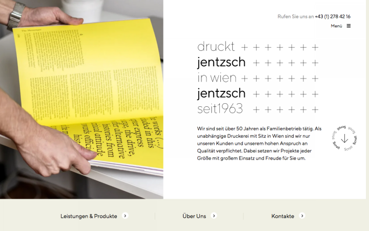
Jentzsch’s website illustrates the company’s well-earned pride as a printing company, dating back to nearly 60 years. Their modern, cutting-edge design style correlates to the rebranding and modernization process that the Jentzsch has undergone as part of their journey to adapt their business model to present times.
Jentzsch successfully finds the balance between their simple, black and white design scheme, highly appropriate for a printing company, along with a sense of revival, seen in their refreshing usage of bright yellow throughout the site. Staying true to their original brand philosophy, the modern, sleek looking ‘plus’ sign is a digital transformation of their original logo, which they’ve proudly carried over from their early days.
The subtle hints of yellow throughout the user navigation flow, such as the vertical Our Services menu (“Unsere Leistungen. Ihre Chancen.”), uses a dual hover effect: hovering over a menu item turns the text from grey to black and adds a yellow dash bullet to the left. Another example of this vitality is the hamburger menu in the top-right corner, which expands into a full-screen pop up with a vibrant, captivating yellow background.
The branding messaging expressed through their color palette is very clear to us: the color yellow is the revival of the paper print agency from 1963 of the past to the digital-oriented 2020 of the present.
Design: Pedro Portugal
Development: Fabian Todt
Theme: GeneratePress
Plugins: Advanced Custom Field PRO, Borlabs Cookie,
Borlabs Cache, Contact Form 7 + Extension for Mailchimp, Ele Custom Skin, EWW Image Optimizer, Lazy Load, The SEO Framework, Ultimate Addons for Elementor, WPML, Redirection, WPS Hide Login, Filebird
Suited and Booted
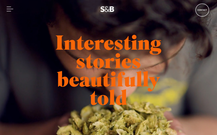
Suited & Booted is a quirky and socially conscious video production company based in Bath, UK. They specialize in creating engaging video content for a wide range of sectors, from NGOs and charities to Food & Bev and Hospitality. Their existing website wasn’t really showcasing the team and their work at their best, so they were decided to use Elementor to create a website that is brand new and a little bit different.
S&B Studios goes far, above and beyond expectations of the ‘typical’ way to use a video background for your website’s hero content. If you think about it, their background is actually a photography masterpiece. The technique of showing two overlapping videos of the same shot: one video of a zoomed-in lens on top of a wider angle, is jaw-dropping.
We especially love the vibrant color scheme, full of bright, summery colors coupled with bright yellow font. What’s noteworthy about S&B’s typography choice is that its headings are displayed in the Superior Title typeface. Superior Title is a traditional serif typeface used in high-contrast design schemes, often for editorial purposes, especially for fashion and lifestyle publications.
The animated entrance used for the hero text sparks user attention just as much as the dual-perspective video effect does, and as a visitor, it’s hard to take your eyes off the page. The unusual navigation menu features a full-screen pop up that slides in after a brief color transition, keeping the visuals exciting and alive.
Finally, the moving rows of text that represent the video production agency’s areas of expertise and services are equally as engaging as the elements above it. This is possibly one of the most lively, exciting websites we’ve seen in a long time.
Design & Development: Something Familiar
Theme: Hello
Plugins: Elementor Supercat, Advanced Custom Fields, Code Snippets
Marten
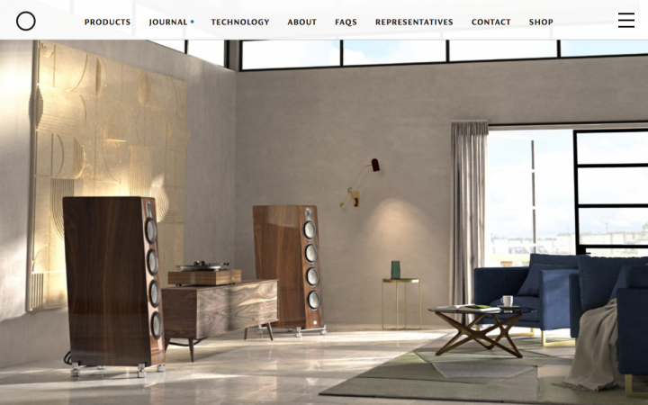
Founded by Leif Mårten Olofsson in Sweden in 1998, Marten is an acclaimed manufacturer of High-End loudspeakers for home use. From its first speaker, Mingus, the product range has grown into Five series, a recording studio and a record label. The company was born out of passion and has grown steadily, gaining success and respect ever since. Marten is still a family business today, run by Leif and his brothers, Jörgen and Lars Olofsson. They pride themselves on manufacturing their speakers locally — 100% Swedish-made.
Marten’s designer built a consistent, grid-based layout around the large, captivating images that are distributed throughout the site. This layout allows their top-tier product line to come center stage and convey their sophisticated brand persona with sheer clarity. The large, vivid photography is complemented by a neutral, low-key color scheme. After all, it is their products that they want to highlight as much as possible. This harmonious combination indicates that Marten is balancing two worlds: the sounds and sights of nature versus the sounds of music.
Another technique that really caught our eye here as unique is the cookie usage notification found in the top right corner, right beside the hero text. Instead of disrupting the user flow with a compulsory pop up about his consent to cookie usage, there is a small two-line paragraph telling the visitor about the cookie usage, which he can opt whether or not to learn more about. This is an unusually clever way to avoid annoying pop ups that aren’t crucial neither to the web design, nor to the customer journey. To sum up, Marten presents a mature yet modern and elegant design language/approach, which goes hand in hand with their prestigious series of products. Beautifully executed!
Design & Development: Patrick Smith
Theme: Twenty Seventeen
Plugins: 360 Photo Viewer for Elementor, Advanced Custom Fields PRO, Akismet Anti-Spam, All-in-One WP Migration, Classic Editor, Disable “BIG image” Threshold, Duplicate Post, Fuse Social Floating Sidebar, GA Google Analytics, iThemes Security, Make Column Clickable Elementor, Marten Elementor Widgets, Official MailerLite Sign Up Forms, Performance Cache, Post Meta Inspector, Public Post Preview, Public Post Preview Configurator, Really Simple SSL, Redirection, Simple CSS, Simple Custom Post Order, String Locator, UpdraftPlus – Backup/Restore, WP Rocket, Yoast SEO
Think your Elementor-based website or landing page should be featured in our next Top 10 Websites column? Give it a shot!
Looking for fresh content?
By entering your email, you agree to our Terms of Service and Privacy Policy.
