The Hotspot Widget focuses on helping you create interactive images that can help you highlight relevant information, boost engagement and increase conversions for your website.
Controls
Background
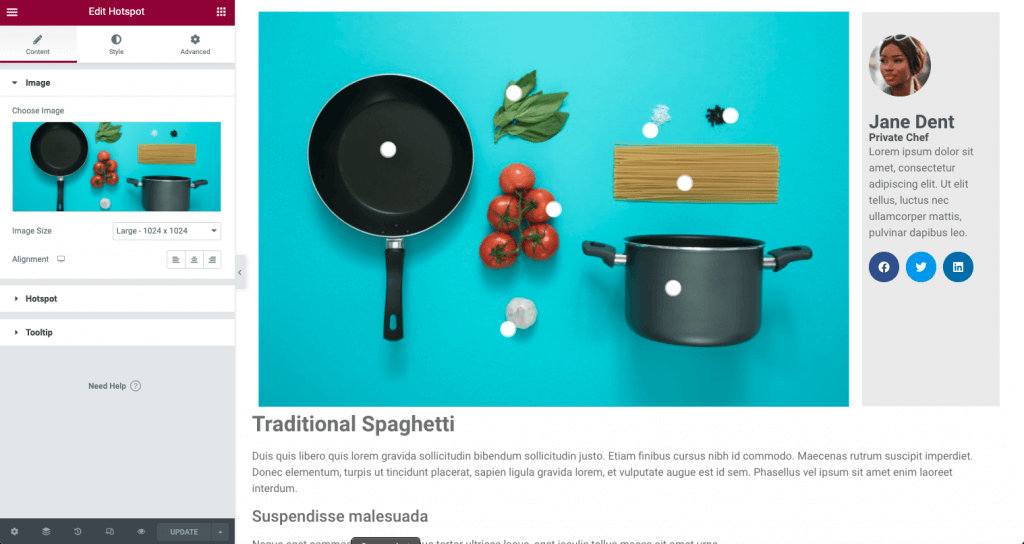
- Image – Chose the background image of the viewport
- Image Size – Choose the appropriate size based on width and height of wrapper
- Alignment – Choose between left, center, or right alignment
Hotspot
Content

- Label – Enter text to display a label rather than a icon indicator
- Link – Enter a URL link for the hotspot. Dynamic Options may be applied
- Icon – Chose the icon of your hotspot from the library or upload your own in SVG format
- Custom HotSpot Size – Toggle this to enable a custom size for the Label
- Min Width – Adjust the width of the Label
- Min Height – Adjust the height of the Label
- Tooltip Content – Using the text editor, enter the content you wish to display in the tooltip content HTML is allowed
Tip: You can use the Dynamic Options in the Link to open an Elementor Popup rather than a tooltip.
Position
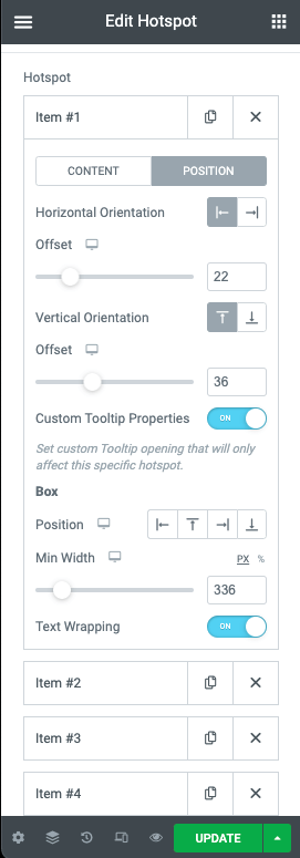
- Horizontal Orientation – Choose the starting position of your hotpot between left or right
- Offset – Use the slider to adjust the horizontal position of the hotspot in %
- Vertical Orientation – Choose the starting position of your hotpot between Top or Bottom
- Offset – Use the slider to adjust the vertical position of the hotspot in %
- Custom Tooltip Position – Provides additional options for display for only the current hotspot
- Position – Choose between Left, Top, Right, or Bottom
- Width – Adjust the width of the box in PX or %
- Text Wrapping – Toggle this to enable text wrapping in your Hotspot
- Animation – Select the animation of your icon
- Sequenced Animation – Toggle to select the use of a sequenced animation effect
- Sequence Duration – If sequenced animation is selected, determine the duration of the animation sequence in ms
Tooltip
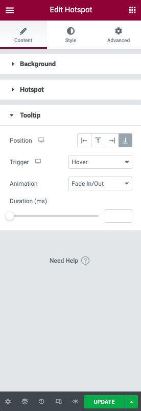
- Position – Chose the position of the tooltip content between Left, Top, Right, or Bottom
- Trigger – Select between Hover or Click
- Animation – Select the animation for your tooltip to appear
- Duration – Adjust the time of the animation in ms
Note: If the Custom Tooltip Position is enabled, the Custom Box Position will be used, rather than the general Tooltip Position.
Style
Background
- Width – Adjust the width of your background image in px, %, or vw
- Height – Adjust the height of your background image in px, %, or vh
- Opacity – Adjust the opacity of your background image
Hotspot
- Color – Use the color picker to choose your hotspot color
- Size – Adjust the size of your hotspot
- Typography – Select the font properties of the hotspot label
- Width – Adjust the width of the hotspot label area in px or %
- Box Color – Use the color picker to choose the label background color
- Padding – Adjust the padding of the label
- Border Radius – Set the border radius of the label
- Box Shadow – Create a shadow effect for the label box
Tooltip
- Text Color – Use the color picker to choose your tooltip content text color
- Typography – Select the font properties of the tooltip
- Alignment – Choose left, right, justified text alignment of the tooltip
Box
- Width – Adjust the width of the tooltip box in px or %
- Padding – Set the padding of the tooltip box in px, em, or %
- Color – Use the color picker to choose your tooltip background color
- Border Radius – Set the border radius of the tooltip box
- Box Shadow – Create a shadow effect for the tooltip box
Advanced
There are no additional options specific to this widget in the Advanced tab.